
Digital
HIT is an Egyptian sports entity providing a range of fitness programs, including CrossFit, yoga classes, and dedicated tracks for kids and teens. After having a major visual identity update—including a name change—HIT needed new materials to showcase their re-branded business. The designs created immediately following the update were clearly highlighting the new name, logo, slogan and colors. Imagery used at that stage were selected carefully to reflect the bold, powerful, energetic and youthful brand personality.
A set of digital designs were created to serve the transition from the name "CrossFit Hitters" back to their original, shorter name "HIT", helping their existing clients to get familiar with the new brand identity. The designs were characterized by a minimalist look with a dominant red color and bold typography. They featured the tagline "CrossFit Hitters is back to HIT".
My work in this project was not limited to just creating the visuals, but I was also heavily involved in setting the art direction as well as copywriting. The samples below were published on the social media, as part of an online campaign announcing the new brand identity.

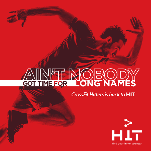

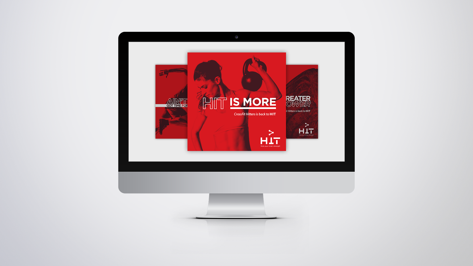
Digital designs created for HIT.
Print
Print materials were particularly important to showcase the brand in real-life touch points, e.g. sports and fitness-related events, booths, brand activations, or any other occasions where physical representation would be require. Shown below are three roll-up banners that were created for HIT. They were, as well, stressing on the new brand identity rather than conveying any event-specific messages.
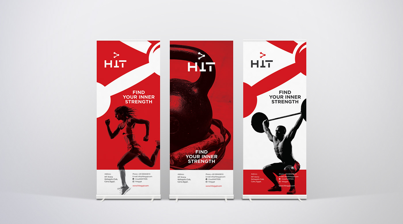
Roll-up banners created for HIT.
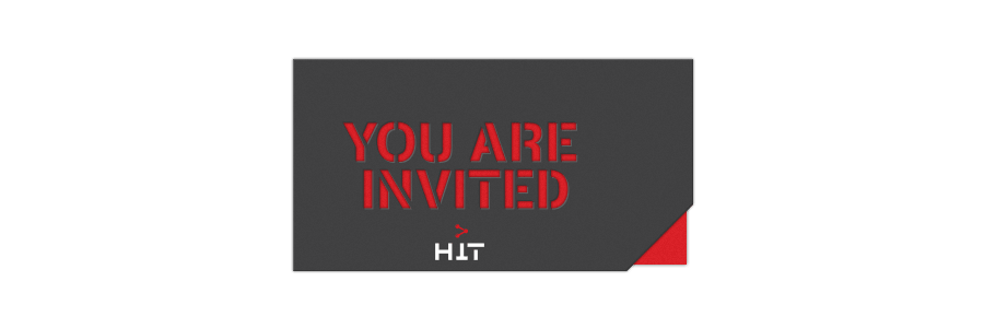
Few months following the announcement of their refreshed brand, HIT was celebrating the opening of their third venue. Among an assortment of both digital and print designs I worked on for that event, I designed an invitation card that was sent to HIT's partners, media representatives and a number of influencers and public figures.
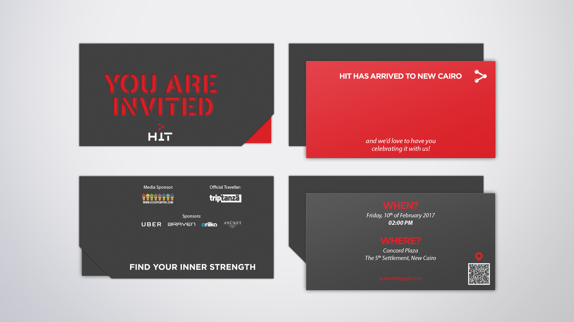
Invitation card design.
The design of the card was minimal, featuring a subtle trick on the envelope. Attention to details was key to turning a fairly simple idea into a more engaging experience.
The line "YOU ARE INVITED" was die-cut on the facing side of the envelope. Thanks to the intended contrast between the cover (dark gray) and the front side of the card (red), the line could be read only when the card is inside. When the card is pulled out, the envelope turns all gray.
A diagonal cut on the bottom-right corner of the envelope was designed to make it easier to pull out the card, while the color contrast also gave it more visibility and made it literally pop-out.
Invitation card in action.
Thanks for watching! 💙
Agency: Seven Heaven