Back in early 2016, I started a mobile-photography solo project titled “OUTSEEN”. Being a designer, I felt a need—at a certain point—to balance the long hours I regularly spend setting on a chair and staring at my computer screen with something more fresh and organic. The project aimed at visually documenting this personal experience of observing, enjoying and connecting to nature.
To know more about OUTSEEN, please follow the link below:
Since my intention was to keep this project running on the long run rather than just a one-shot experiment, it made perfect sense to come up with a name and create an identity for it. A brand identity was not only to help people better recognize this project whenever new photos are published online, but it was also important to showcase the overall experience as a big picture with smaller snippets within it—something that scattered photos could not achieve as effectively.
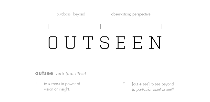
Naming the project, I had several points in mind; the name needed to representative, meaningful, distinctive, and easy to remember. As this project was meant to be published online—specifically on Instagram and VSCO—I thought it would be a smart move to choose a name that can work as a unique hashtag on these platforms as well. Hence, I shifted my thoughts away from popular words, yet I also tried to avoid strange, hard-to-pronounce, or very long names.
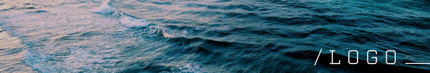
Even though the logo is an essential element of the project's identity, but the last thing I wanted is to end up with a logo that distracts the viewers from enjoying the pictures. Keeping that in mind, I decided to:
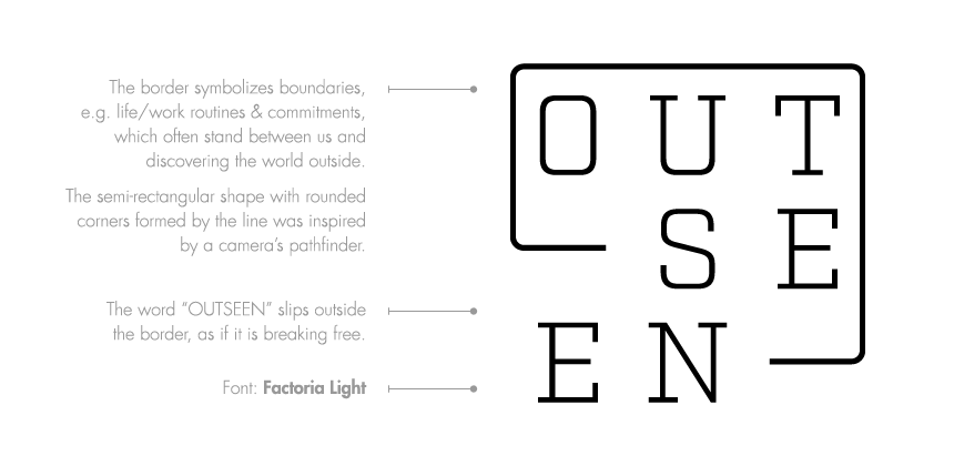
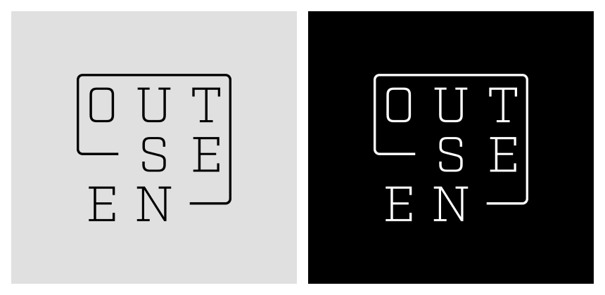
1. Take a minimal approach in designing the logo.
2. Limit the color palette to only black and white.
3. Place the logo only on intro (cover) photos of seasons and episodes, rather than placing it on every single picture (the project's structure is explained in the following section).
I realized from the beginning that I won’t always have enough time—or enough motivation—to keep this project running on a 365-day basis. Instead, I decided to make it in the form of separate time-to-time parts. This way, I could have the ability to focus on the quality of the experience itself, rather than turning it into a stressful task.
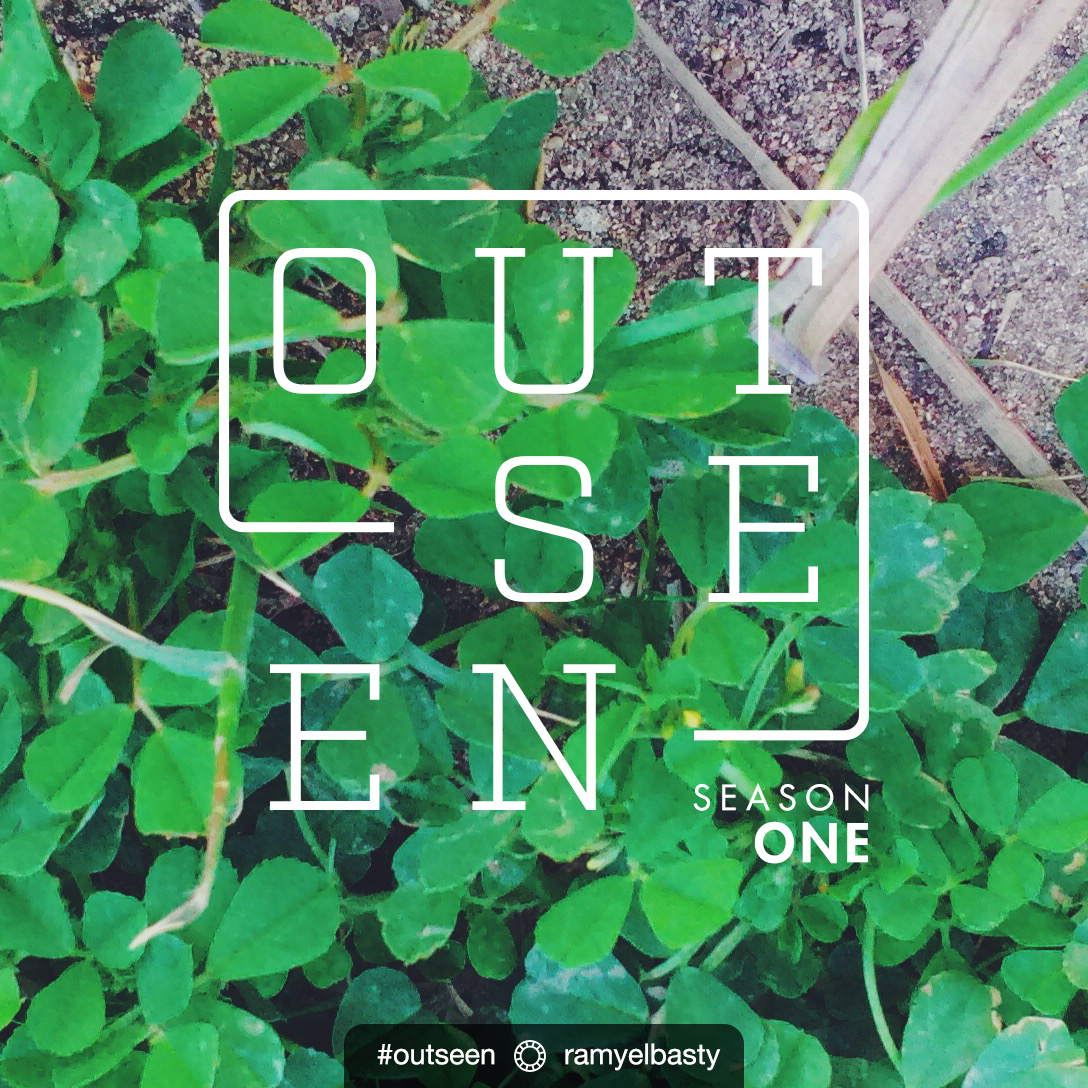
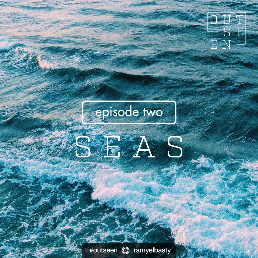
I wanted to present OUTSEEN in a way that people would enjoy to “watch”, and be waiting for new photos to come out online, slightly similar to watching an interesting TV series. From that point, I chose to build the project in the format of “seasons” that split into “episodes”, where each episode showcases a number of related photos of the same theme (e.g. flowers, trees, etc.) Choosing “seasons”—instead of a different word like “chapters”—for a nature photography project was also very relevant and intriguing, in fact.
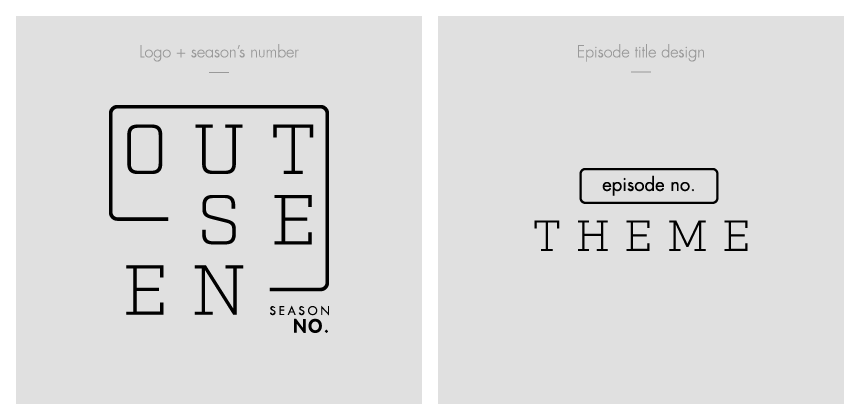
I didn’t set a specific number of photos per episode, nor a specific number of episodes per season in general. Again, a little bit of flexibility is a good practice for a long-term project. However, I decided to fix the number of photos in all episode of the same season, and that was for the sake of consistency and a better presentation. In season one, I published a total of 4 episodes, with 6 photos (plus cover photos) per each of them.
OUTSEEN Season One can be fully viewed on my VSCO profile here: https://vsco.co/ramyelbasty
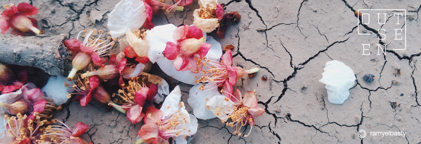
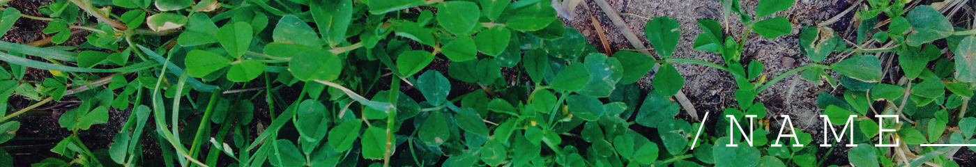
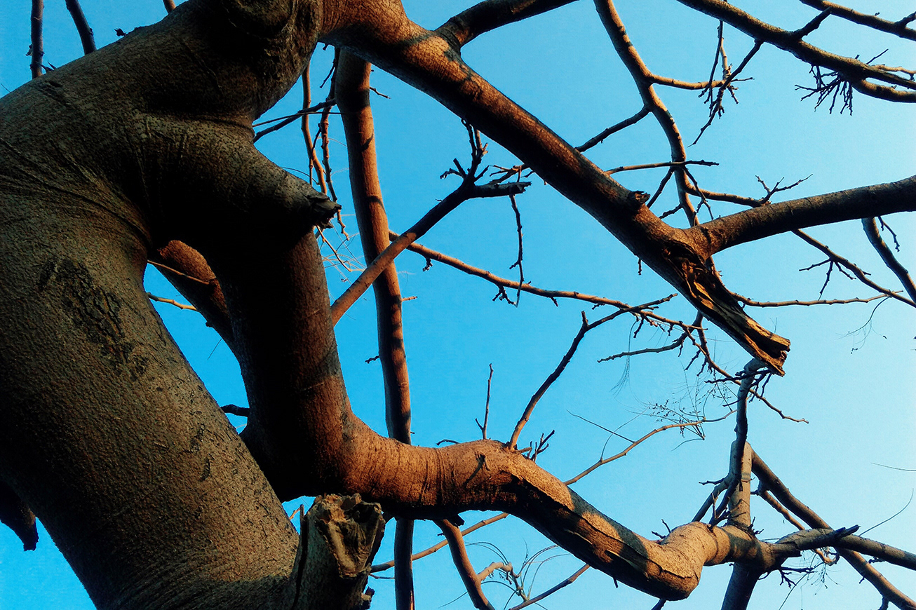
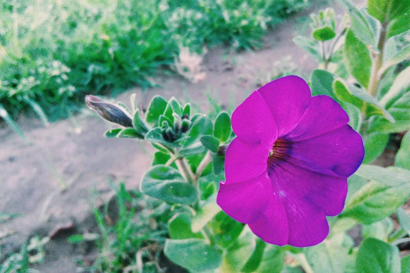
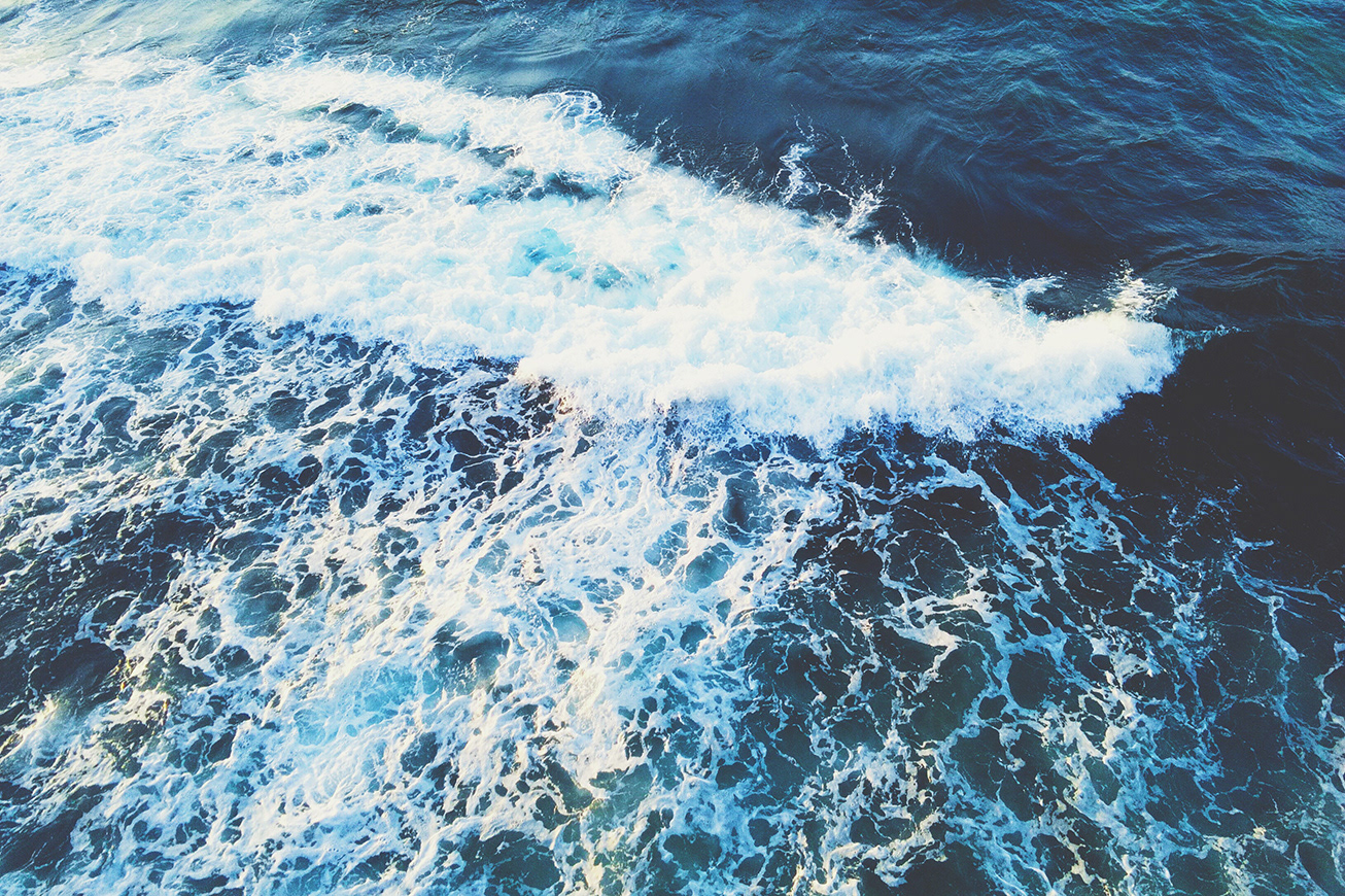
Below are selected photos from the project:

Thanks for watching! 💙
Copyright ©Ramy Elbasty. All rights reserved.